Designing promotional materials for the Library of Mistakes
You’re probably well acquainted with our iconic logo and straplines – our brand is really important to us as we deliver top class financial history education around the world. But there’s a lot that goes into visual brands such as ours, here our designer Oliver Haas, who recently won a coveted Graphis Advertising award for his work for the Library of Mistakes, writes about his experience.
The story leading up to this promotional campaign for the Library of Mistakes (LoM) started in 2013, when the founder and keeper of the library, Russel Napier, got in touch and told me about his idea of establishing a library focused on financial mistakes, knowledge that was woefully overlooked in financial education and industry. It was to be a physical library for which he needed a logo and fundraising pamphlet.
I was in my tenth year as an independent graphic designer balancing branding work with mainly literature and infographics for non-profit organisations. Most of my work comes from personal recommendations and I knew this one was special: Edinburgh is the second largest financial centre in the United Kingdom after the City of London. It is also a globally recognised place of learning with four universities. A library specialising on financial mistakes would therefore make some waves and its brand would have to be equal to that.
My approach to branding is partly shaped by the study of humour in advertising. At the heart of this is a principle that applies to the best of design. Simply said, it is a combination of two frames of reference, one relating to the business or service itself, the other to its core value, message or activity. If that is expressed in a visually elegant and witty way, you have a winner. Ideally, to me, a logo is like a punchline to a joke, it is rewarding, joyful and memorable.
For the LoM logo design I side-stepped the ubiquitously used heraldic shields and book icons of other educational and library logos. For a new and unknown institution I found it important to emphasise the name in a simple word mark. And for the twist, the capital M gifted itself as a performance graph in a downturn that captured the spirit and purpose of the library.
The funding drive, the first outing of the LoM identity, was successful and the library was opened in 2014 by former British Chancellor of the Exchequer, Norman Lamont. In the following years, the library established a quirky and sometimes irreverent way of communicating. For example, in 2015 Russell commissioned me to design a label for a beer, specially brewed as a gift for supporters, called ‘Roughly Right’ based on a quote by the economist John Maynard Keynes. Of course, the label included mistakes and some bottles in each case had their label applied upside down.
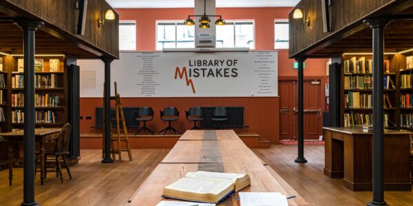
Later, when the library outgrew its original building I was asked to design the brand signage for the new Edinburgh premises and to find suitable quotations for wall murals. During my research I found that quotes did not quite fulfil the potential of the occasion, that here was an opportunity to go beyond the brief and write some new material with the library’s own voice that could be used to raise awareness and build stronger ties with existing users, the ‘errorists’ who had embraced the brand.
The copy and designs I presented suited the irreverent tone and humour with which the library is able to engage with venerated financial concepts such as bull and bear markets and puncture the conceit of experts by calling them mugs and ants. They show the library to be unstuffy and gutsy, and to have the authority to expose mistakes and bluster without being preachy. The brevity and simplicity of the executions suits both the messages and the very limited library funds. The fact that items such as postcards, bookmarks and pencils could be produced at low cost played a major part in them being realised.
The library was excited to move ahead with the ideas and we produced an initial batch of items in early 2023. The items are on sale at the library and during local and away events where they also help to create a brand ambience. In the meantime, a Library of Mistakes has been established in Pune, India, and Lausanne, Switzerland with further locations planned in London, Sydney and Amsterdam. The story so far shows that the development of a brand can be anything but linear. Keeping the brand language consistent over time and internationally is an important challenge that will require continuing careful guardianship.